ADAM Brubaker - Logo design portfolio
Creative exploration, professional execution.

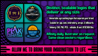
I came to graphic design by necessity. Music has been my life, and when I couldn’t afford to hire designers for album art, I taught myself. Over thirteen years of creating graphic humor and exploring every corner of visual storytelling, I sharpened my eye. My style began outside the box, and over the last six years, I’ve refined it into a professional craft. My taste is only a starting point. The real work is drawing out the quiet ideas in my head and shaping them into clear, memorable brands.
One of my most significant attributes is the ability to design across the spectrum. I put the same level of creativity and dedication into structured, minimalist logos as I do into expressive, outside-the-box concepts, and both produce work that is professional and unique.
The constant is rigor. Each concept is shaped into a distinctive asset that’s recognizable at a glance but comes to life up close.



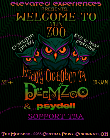
I’m a digital artist who does far more than logos, and you’ll see a psychedelic style in a lot of my personal work. I come from the music industry, where gradient-heavy, dimensional visuals are common in the electronic music scene, which is where my journey began.
My personal style will never bleed into professional client work outside the music space. I mention it because psychedelic work forces precise control of spacing, geometric structure, figure–ground, and closure, plus solid color theory and typography. Those skills translate directly into logos that read fast, scale clean, and stay clear on real backgrounds and materials.


Brief & Positioning
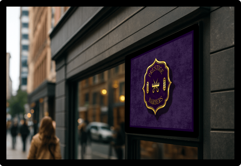
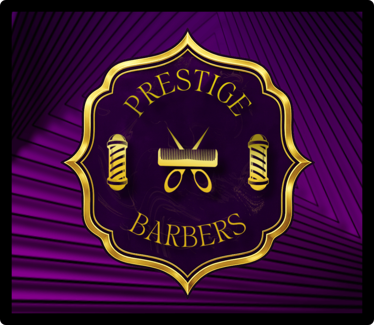
Prestige Barbers is a selective shop in Georgia where the owner hand-picks what he considers the most talented barbers in the state. He wanted a name and identity that felt like entry into a guild, while resonating nobility. I framed the brand as “invitation-only craft,” and anchored the palette in deep purple and gold, which are colors historically tied to royalty, scarcity, and prestige. To me, this was the signal a curated shop should send. Purple’s long association with wealth and ceremonial status is well documented, and gold consistently codes for achievement and high merit.

Form Language: Crest, Poles, and Type
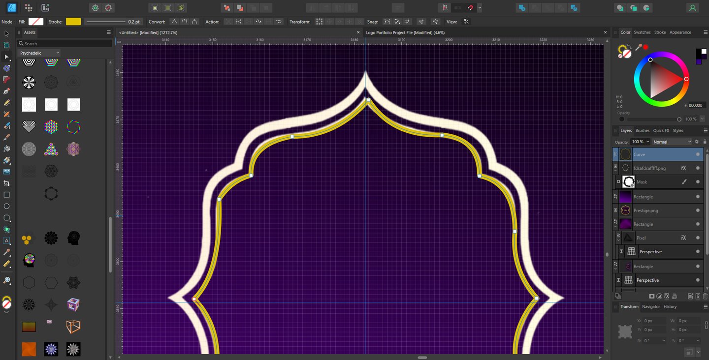
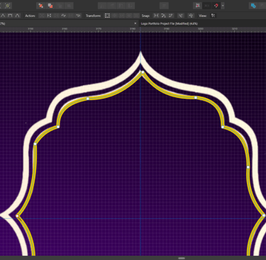
Color theory is merely one of the first elements of research established as I approach every project. Research and discovery are arguably the most important elements that, if done efficiently, will trickle into every other facet of the logo. My deep dives led me to find that “guild” feeling by designing the primary shape as a plaque/crest. This proved to be a modern nod to heraldry that signals lineage, standards, and protection of craft. Crest and shield forms are the core vocabulary of heraldry and instantly read as formal and time-tested.
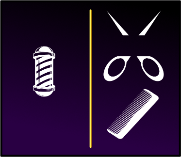
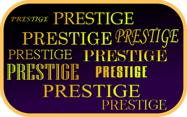
The supporting icons (barber poles, shears/comb) sit inside the field to connect the shop’s present to the trade’s past; the pole is a direct reference to historic barber-surgeon practice, which is why its stripes are so iconic. For letterforms, I used a refined serif with generous curves to push “premium and ceremonial” rather than tech or street. Research on type perception and luxury consistently shows serif forms cueing quality and heritage when used with restraint.



Color & Finish: Why It Looks “Regal” Without Looking Gaudy
Purple carries the status; gold supplies the ceremony. I kept the gold treatment tight to borders and highlights so the identity feels elevated, not loud. Black/purple ground + gold accent is a proven luxury pairing because black connotes formality and restraint while gold carries prestige; the balance keeps the mark readable on signage, glass, and embroidered caps. A high-contrast mono version lives alongside the full treatment for tiny sizes and single-process applications.
Outcome and rollout
The goal was simple: a logo that signals invitation-only skill and still reads at street distance. The purple-and-gold crest does the job. It carries the “regal” feel the owner wanted, and it stays clear on glass, metal, stitched caps, and signage. The arced type and barber-pole icons connect the shop to the craft without looking dated.
